The ’Riginal Ranch Remodel


Shot of the very moody Master bathroom vanity, near right. And yes, for those with eagle eyes, that is CARPET on the floor. It extended into the toilet room too, in case you’re wondering.
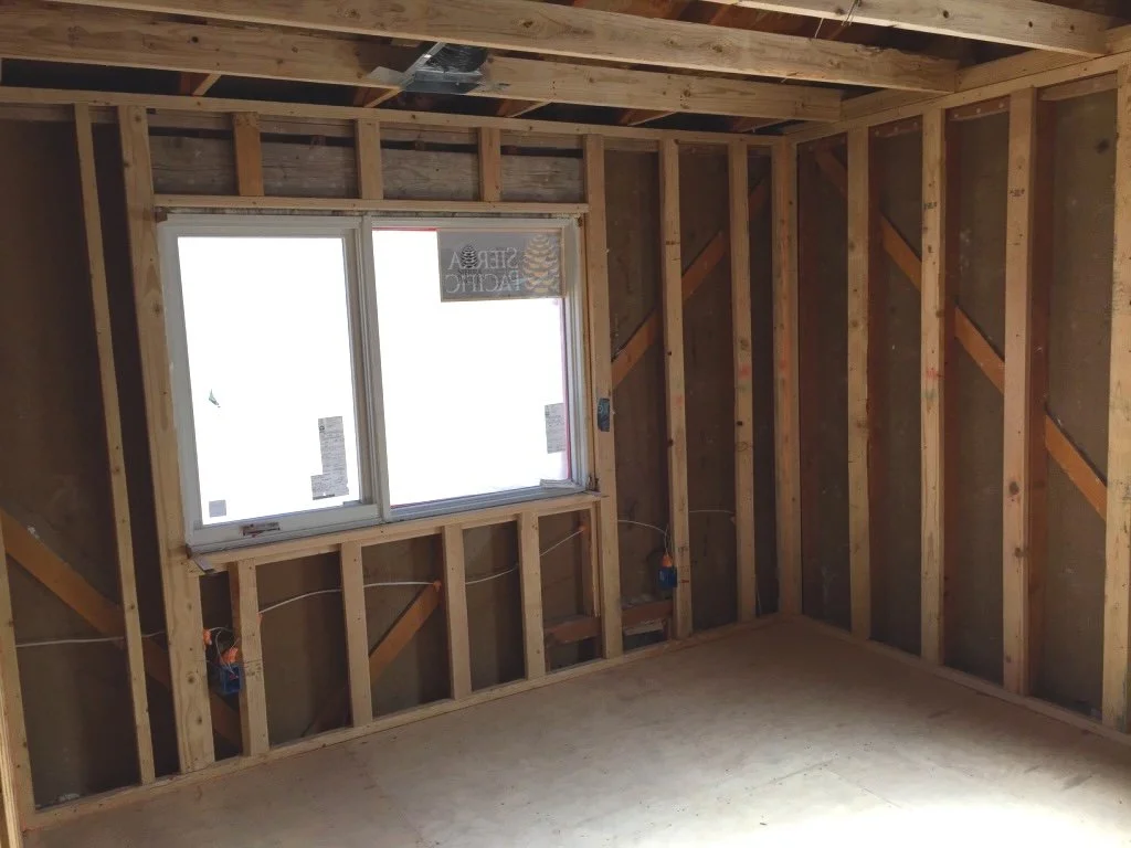
With a new layout in place, I turned my attention to another challenge: insulation. The house didn’t have any, which is another fun discovery we made while living there before construction. That was probably the coldest I’ve ever been during the winter in any structure besides a camping tent. Actually, there are probably some tents that are warmer. Anyway, adding insulation was a priority.
I explored using closed-cell spray foam, but costs were high and I was determined to stay on budget. Instead, we added furring strips to the 2x4 walls to accommodate less expensive fiberglass insulation, which saved us around $10K. This was one of many moments where balancing cost and comfort required tough choices.
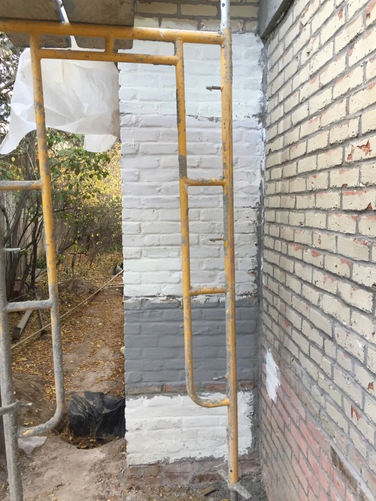
For the exterior, we had to address the infamous weeping mortar. Replacing the brick entirely wasn’t an option due to cost, and re-cladding over it with another material was problematic due to restrictions on exterior materials imposed by the neighborhood HOA. The most cost-effective solution was to re-point the brick (chisel off excess mortar and re-shape the joints), and then apply a mortar wash finish over top. Mortar wash is sort of like stucco’s thinner cousin. We went through several samples before selecting the final color and thickness.
Original House, View From the Street
Mortar Wash: Initial color samples
Existing Sunken Living Room
Existing Kitchen
Existing Tiki Bar
Ok, we’ve established that the original house needed some work. But once we moved in, reality hit fast. The house was too small, poorly insulated, and had a layout that made daily living inefficient. We had to decide: build up or build out? How could we maximize the existing space while keeping the Ranch’s long, low proportions that we loved? And most importantly, how could we create a functional, beautiful home without completely blowing our budget? These questions would define the design strategy and require some creative solutions.

Some photos of the existing house, at right. What’s not to love, right? Gnarly trees, a totally out of control juniper bush, and—my god could it be? Why yes, yes it is!—painted brickwork with ‘weeping’ mortar joints! What a sight to behold.
If you’re not familiar with the architectural scourge that is weeping mortar joints, it was a decorative style of brickwork used originally in the ‘20s and then revived (for reasons unknown) in the ‘50s. Injudiciously large quantities of mortar were slathered between courses of bricks, and then squeezed out in the most haphazard way possible. It was an art…or so they say. By the way, a normal mortar joint is supposed to be set in from the face of the brick, to shed rainwater. Weeping mortar joints? Well, they pretty much do the opposite.
Some detail shots of the weeping mortar, at right.
Needless to say, we didn’t buy the house because of the weeping mortar…more like we got a good price on the house because no one else wanted to buy it. And while the exterior wasn’t exactly charming, the interior was no slouch either.
Behold, the sunken living room, complete with parquet floors and built-in ‘Hi-Fi’ stereo. And that weird dark spot, high up on the wall in the photo to the far right? Apparently that’s where the previous owner mounted a taxidermied marlin, and when the wall was painted they simply painted around this area. Bonus points for anyone who correctly identified the dark spot as ‘marlin-shaped’ before you read this.
Galley kitchen, far right. Maximum occupancy: two people.
Master Bedroom, near right, with some peculiar DIY art the previous owner installed on the wall, made from wood furniture scraps like table legs, corbels, etc., and then painted to match the walls. I actually kind of loved this.
Basement Tiki bar, far right, built by previous owners. Like I said, this house had it all.


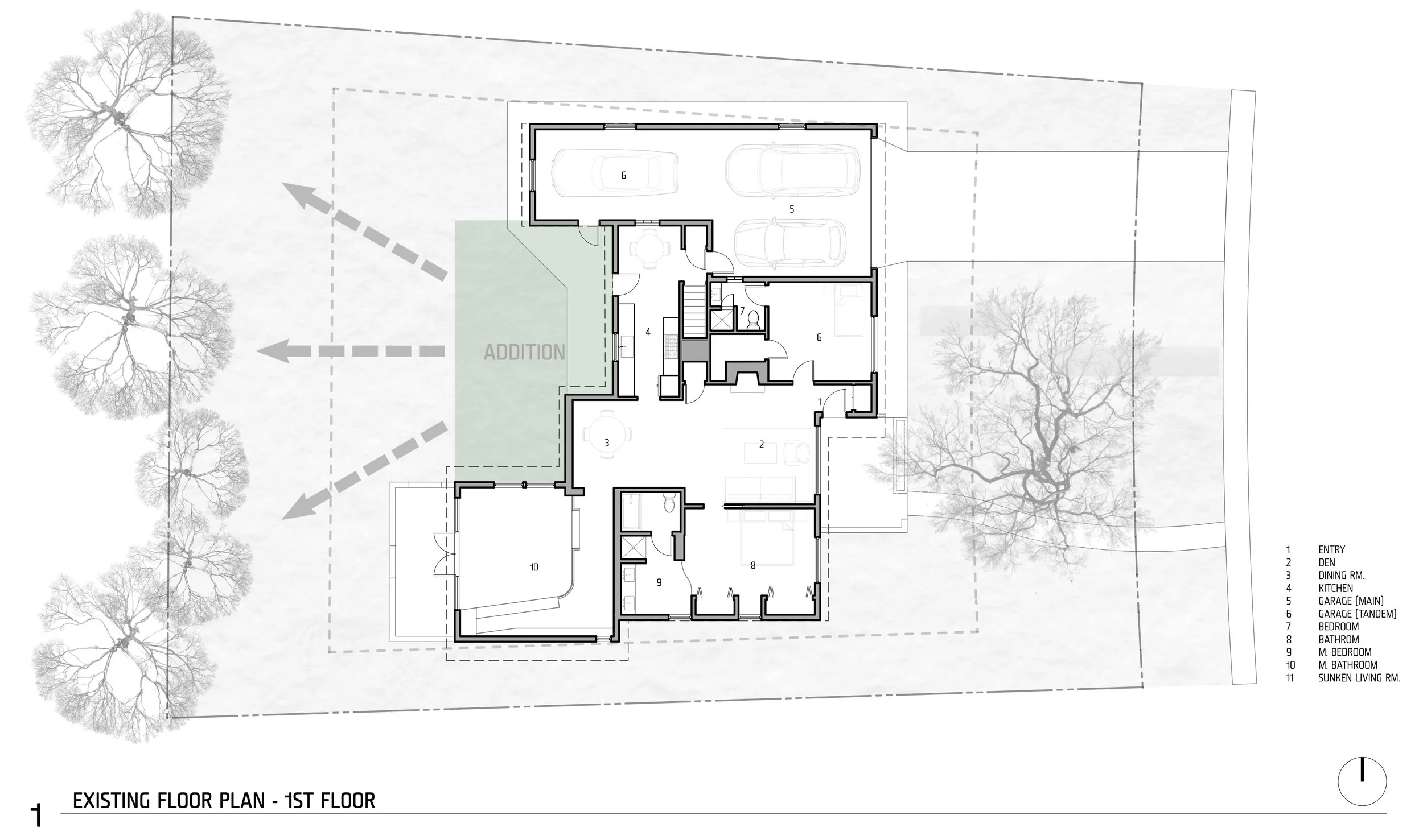
Our family needed three total bedrooms (all on one level), a master suite, an open-plan kitchen, a functional home office, and better overall flow. Instead of adding a second story, I decided to expand the existing footprint in a way that preserved the Ranch’s essence.
First, I identified underutilized spaces: a partially sunken living room that made the house feel fragmented and a tandem parking space that was more valuable as living area than garage storage. By framing up the floors of these sunken areas and converting the garage space, we reclaimed nearly 600 sq. ft. without expanding the footprint.
Sunken Living Rm. Areas shown in blue, at right.
Next, I considered where an addition would have the biggest impact. The center of the house was the logical choice. It allowed us to create a larger, more open living, dining, and kitchen area, all with a direct connection to the backyard—where our family would spend most of our time. It also avoided the southern edge of the property, which was heavily shaded by trees and felt extremely cold in the winter (we discovered this during the year we lived in the house before construction).
Area of Addition shown in green, at right.


Furring Strips on inside face of existing 2x4 exterior studs, to increase framing depth and insulation thickness
The mortar wash we chose smoothed over but also preserved some of the brick’s texture and the chalky color also gave the whole thing a more modern feel. Stained western red cedar siding was added as a warm accent. The cedar was oriented vertically and with a random mix of board widths, for some subtle visual interest. A staggered concrete walkway was added (lightly tinted, with a sand finish), as were some new plants and tree.
And that gnarly tree in the front yard? A haircut and a little TLC revealed it to be a stunning Russian olive tree, now a favorite climbing spot for our kids.
This project was more than just a remodel; it was the foundation of our life in Denver and the first chapter of LTBa. It taught me invaluable lessons about balancing design, cost, and practicality—lessons I now bring to every project. In the end, this house wasn’t just saved; it was transformed into a home that will serve our family for years to come.
After about a year of construction, our reimagined Ranch was complete. The once-cramped living spaces were now open and filled with light. The kitchen became the heart of the home, with a seamless flow to the dining and living areas. The master suite was a peaceful retreat, and the new layout brought much-needed functionality to our daily lives.
Here’s the final floor plan, at right, and photos of the finished spaces below:

Mortar Wash: From another project, but illustrates different thicknesses that can be achieved: thicker application on the upper area fills in brick joints and flattens things out, vs. lower area which is thinner and shows more brick texture


LTBa has done a lot of remodel/addition projects over the years, but the first project we ever did was a Ranch remodel/addition that our founder, Luke Taylor-Brown, designed for his own family. Here’s his story, our ‘riginal ranch remodel project:
When our family moved to Denver in 2014, we knew we wanted a home with character—something we could shape into our own. What we found was a 1950s Ranch that had seen better days. This house had it all: a chopped-up and too-small layout, a sunken living room that felt like a pit, an inefficient tandem garage, and the pièce de résistance—weeping mortar joints that seemed to be crying for help. But beneath the dated exterior and awkward layout, I saw potential. This one wasn’t going to be easy; it was the first project I would take on as both architect and homeowner.
Some say ‘weeping’ mortar was named for the emotion it elicits in modern architects…
Existing Sunken Living Room
Existing Master Bedroom
Existing Master Bathroom